
Data Analytics User Guide
The Data Analytics User Guide is designed to help Primavera clients utilize the Data Analytics App by providing step-by-step navigation, tips and insights.
You can click on the topic you would like to view in the Table of Contents.
Table of Contents
Part 1: App Features
Part 2: Summary Dashboard
Part 3: Membership
Part 4: Revenue
Part 5: Medical Economics
Part 6: Service Fund
Part 7: Performance KPI
Part 8: Care Gaps
Part 9: Encounter Submissions
Part 10: Insight
Part 11: Data Tool
Part 12: Communication Center
Part 13: Tasks
Part 1: Analytics App Features
Filters
- Users have the ability to filter and customize each Dashboard or Report.
- Each Dashboard and/or Report have unique filters that can be applied to a selected data set.
- The filter button can be found on the upper right corner of the Dashboard or Report.
- The number in red indicates the number of filters already applied.

Example of filter options:

Note: Once a filter is applied it will apply to all other Dashboards and Reports within the Analytics App, not just current view.
Steps to Save Filter:
1. Click on the check mark next to the Title of the Dashboard or Report, located on the upper left corner
2. Name Filter
3. Select Visible to Just me or All users
4. Click on Save button
Access Saved Filters:
1. Click on menu button to left of title of dashboard or report view
2. Option to search for a view by name or apply one of your save My Views or Shared Views
Clickable Hyperlinks
Throughout the Analytics app reports and dashboards there are blue hyperlinks. These blue hyperlinks are clickable to drill down further into data.
For Example:
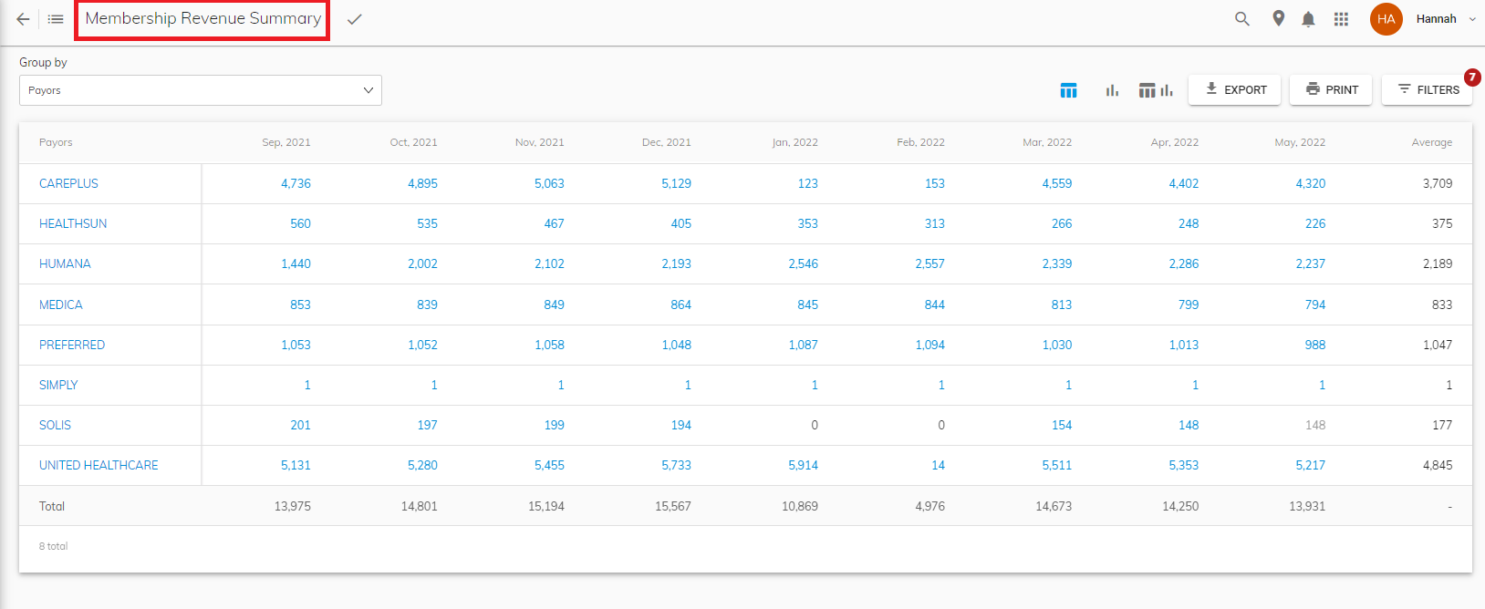
1. Navigate to the Summary Dashboard
2. Click on the Total Patient Population blue hyperlink (in this example: 13,931)

3. The platform automatically navigates you to view the Membership Revenue Summary report to view members by group.
Navigate to Patient Level
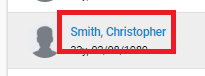
At any point in time within the Data Analytics app, when a patients name is indicated in blue hyperlink you have the option to click on the name and drill down to the patient chart.
Steps to Navigate to Patient Chart
Option 1:
1. Within any report of dashboard that a patient name is listed in blue, click on the patients name.
2. Patient chart will show patient details including financial summary, form/surveys, encounters, monitoring history, care gaps, cases, documents and audit trail of patient.

Option 2:
1. Search for patient by name on menu bar by clicking the magnify glass
2. Search box will appear where you can type patient name and select
Export and Print
All reports have the ability to Export and Print. Steps to Export or Print:
1. The Export and Print Option will be available to click on in the upper right hand corner of dashboard or report view. Click on the action you want to execute, print or export the current report or dashboard viewing.
Note if the file export is larger then the maximum size supported, you will receive this notification and the exported data will be emailed in a link. Once link is received in email, you must download the report or dashboard from the email.

Toggle between Report Views
- Grouping reports throughout the app allow you to toggle between a Tabular view, Chart view or a Tabular and Chart view Combination. This option is located on the upper right hand corner of the report you are viewing.
- The current view type you are viewing is indicated in blue.
Interactive Report Gadgets
- To customize the data you are viewing, report gadgets allow you to click on the key and remove specific indicators shown in the report.
Steps to Customize Report Gadget:
1. Click on the indicator that you want to remove (for this example I will click on Aetna).
2. The indicator will become grayed out and will not show on the report gadget anymore.
Navigating Back to Previous Report/Dashboard
- At any point in time a user has drilled down into a report or dashboard, they can click the back button located in the upper left hand corner to navigate back to original report or dashboard view.
Part 2: Summary Dashboard
Description: Summary dashboard shows 6 different gadgets with different important clinical and financial data to track.
Features:
1. View your Total Patient Population trends over the selected period.

2. View your current Population Demographics: Details show total patients, percentage of male versus female, new patients and the percentage of new male patients versus new female patients.

3. View Patients at Risk: Details show total patients, total new patients and the number of patients that continue to be at risk (Reminder you can click on any blue hyperlink on this dashboard and view additional details).

4. View Funding PMPM (Per Member Per Month) Cost: Gadget shows the Current Period indicated in blue versus the Previous Period indicated in yellow.

5. View Inpatient/Outpatient Claims PMPM (Per Member Per Month) Cost: Gadget shows the Previous Period: Outpatient, Previous Period: Inpatient versus the Current Period: Outpatient and Current Period: Inpatient.

6. View your Medical Loss Ratio (MLR): Gadget shows a comparison of the Current Period (blue) vs. Previous Period (yellow).

7. View your IP (Inpatient) Admits per 1000: Gadget shows comparison of the Current Period (blue) vs. the Previous Period (yellow).

8. View your ER Visits/OBS per 1000 Gadget shows Previous Period: ER Visits, Previous Period: OBS versus Current Period: ER Visits and Current Period: OBS.

9. View your RX Generic %: Gadget shows the Current Period (blue) vs. the Previous Period (yellow).

Part 3: Membership
Summary
Description: Grouping report that tracks membership monthly by group using your payor eligibility files.
Features:
1. Group monthly membership by Payors, Location, Primary Provider, Insurance PCP, Financial Class, County, Chronic Condition or Age Group.

Trend Graph
Description: Track membership trends of enrollment, disenrollment, contracts, churn percentage, monthly retention rate and final memberships by month through your payor eligibility files.
Features:
1. Ability to show more details within Trend Graph by click on the downward arrow on the right hand corner of top of the report.

2. Legend to reference terms at bottom of Trend Graph.

Transaction Logs
Description: Track new eligibility file updates. (Example new patient enrolled or disenrolled patient.)
Features:
1. Option to Read, Read All, Send or Create Case. Marking the file as Read, will remove the file update from the list of Transaction Logs. Option to Send, sends the file to the selected user with the assigned due date.

Part 4: Revenue
Summary
Description: Grouping report that tracks membership monthly by group using your payor revenue files.
Features:
1. Group report by Payors, Location, Primary Provider, Insurance PCP, Financial Class, County, Chronic Condition or Age Group.

Trend Graph
Description: Track membership trends of enrollment, disenrollment, contracts, churn percentage, monthly retention rate and final memberships by month through your payor revenue files.
Features:
1. Ability to show more details within Trend Graph by click on the downward arrow on the right hand corner of top of the report.

2. View legend to reference terms at bottom of Trend Graph:

MRA/RAF
Description: Track MRA/RAF(Medicare Risk Adjustment) Score through this monthly grouping report.
Features:
1. Group report by Payor, Location, PCP, Provider, Financial Class or Group.

Part 5: Medical Economics
Summary
Description: Grouping report that tracks your claims data trends of monthly payments and total claims submitted by selected group.
Features:
1. Option to group report by Payors, Location, Specialty, County, Primary Provider, Insurance PCP and Financial Class.

2. Option to switch to PMPM (Per Member Per Month). This shows claims summary report allocated at the patient level.

3. Additional graph data available to view based upon your payor claims files.
Claims
Description: Report shows all of the practice's paid claim activity from claims files. Details include: claim number, patient, description, type, billed amount, paid amount, status, DOS, specialty, paid date, payor, insurance PCP, location and county.
Features:
1. Ability to search for a specific member or claim by using search bars in the upper left hand corner of the report:

2. Ability to drill down to view claims details by click on claim number.
Detail Claim View:
Top Utilizer
Description: This dashboard allows users to track high utilizers, top prescribed drugs, frequent fliers in the hospital/ER and top high expense CPT codes.
Features:
1. Option to choose limit to filter to show top 10, 15 or 20 patients on dashboard.

2. View Top Highest Utilizers within your practice or clinic over selected period of time:

Note if you are using the Primavera Data Analytics App in combination with the Case Management App, you can create a case instantly on the Top Highest Utilizers, Top Frequent Fliers in Hospital or Top Frequent Fliers ER gadgets by clicking on the plus sign next to the patient's name under Actions, as shown in image below.

3. View Top Prescribed Drugs over period of selected time:

4. Top Frequent Fliers - Hospital Admissions

5. Top Frequent Fliers - Emergency Room

6.Top Highest Expenses CPT Codes

Inpatient
Description: Easily track when patients are receiving different types of inpatient care and the patient progress monthly with this dashboard.
Features:
1. Track frequency of inpatient events on a monthly basis with bar graph:
2. List view of all your patients admitted for inpatient visit. Details shown on report show Event Name, Facility/Place of Service, Admission Date, Discharge Date, LOS, Billed Amt, Paid Amt, Primary Diagnosis, Diagnoses, Payor and Location:

2. Identify trends of your practice with report gadgets at bottom of Inpatient Dashboard: Top 15 events, Top 15 Facilities and Top Billed Patient Amount (Reminder you can click on any blue hyperlinks to view more details):

Pharmacy
Description: Use this report to track all your generic or brand prescriptions. Details of RX shown such as claim ID, patient, medication, qty, paid amount, DOS, type, specialty, prescriber and store name.
Features:
1. Ability to search for a specific Rx by using the search bar in the upper left hand corner of the report.

2. Sort prescriptions by All, Generic or Brand.

LAG Report
Description: Financial report that shows the time span between the occurrence of a claim and the month the payment was received.
Note the top row of report indicates when service was provided/date of service and side column indicates when payment was received:
Part 6: Service Fund
Description: Financial summary report shows the financial impact of your practice monthly through financial indicators listed on the left side of the report. Indicators can be compared over selected time through filters selected.
Features:
1. View the indicator details by clicking on the arrow to the right of the indicator title. For example, To view Inpatient details, click on the Inpatient indicator arrow. Once arrow clicked, details of Inpatient shown:

2. View Indicators on patient level by clicking on the PMPM (Per Member Per Month) button. When the PMPM button is selected the financial indicators will show the average PMPM as shown below.


3. The average of each indicator can be found by scrolling over to the right side of the report.
Part 7: Performance KPI
Description: Track 50+ KPIs monthly within this report.
Note a user with admin access will have the ability to set benchmarks (goals) for the organizations KPIs within the Admin App. If you need help setting up your benchmarks, please contact the Primavera support team. A benchmark is met that month indicated by green font versus not met showing red font as shown in image below:
Features:
1. Option to Group Performance KPIs by No Grouping, Primary Provider, Insurance PCP, Locations, Payors or Financial Class.

2. Ability to add or remove KPIs shown on report by checking box or unchecking the box next to indicator listed.

3. Toggle between three different view options:
First view option shows your KPI Performance dashboard.
Second view options shows 4 different gadgets to track Encounters per 1000, OBS per 1000, Admits per 1000 and Readmissions %
Third view option shows a combination of the KPI Performance Dashboard and the 4 gadget reports.
4. Option to click on the question mark next to KPI listed to view the associated formula.

Part 8: Care Gaps
Description: Report listing all your organizations associated care gaps and patients. Report details include care gaps, eligible patients, status, location, payor and PCP.
Note a user with admin access will have the ability to configure care gaps for your organization within the Admin App. If you need help setting up your care gaps, please contact the Primavera support team.
Features:
1. Option to Search by a patient's name.
2. Filter options include toggling between Status of care gap of Passed or Failed.
3. Filter option to view specific care gaps that will show on report. Care gaps that will show on report are indicated by blue check mark in box next to care gap name. To remove care gap from report, simply unselect the box.
Note if you are using the Primavera Data Analytics App in combination with the Case Management App, you can create a case instantly on this report by selecting the box next to the patient's name and clicking the Send to Care Team button.
Part 9: Encounter Submissions
Description: This module allows you to find and list patients with missing HCC/Diagnosis codes ( GAPS ) for the current year, using the MMR and MAO files as a source of truth. This module allows customers to identify, reconcile, and fixed missed GAP by filling data back to EHR, Payor, CMS using Shadow Files, RAPS and 837 file submission.
Part 10: Insights
Monthly RCM Report
Description: Monitor and track your RCM (Revenue Cycle Management) with this monthly report. Note this report has to be managed manually unless there is a connection with your EHR is established with Primavera. If you have further questions, please reach out to Primavera's support team.
Features:
1. Add a New Indicator by clicking the Add Indicator button.
Once selected, Indicators options will show including indicator key, primary provider, insurance pcp, location, payor, month and value. Click Save when complete.
2. Edit existing indicators by selecting the box next to indicator, then clicking Edit Indicator button.
Chronic Condition
Description: Monitor and track chronic conditions that are impacting your patients most on this dashboard.
Features:
1. View percent distribution of Prevalence of Chronic Conditions among Beneficiaries:

2. View percent distribution of Prevalence of Chronic Conditions among Beneficiaries by Age
(65 years and older VS less than 65 years):

3. View the distribution percent of Prevalence of Chronic Conditions among Beneficiaries by Sex:

4. View percent distribution of Prevalence of Chronic Conditions among Beneficiaries by Medicare and Medicaid:

5. Prevalence of Multiple Chronic Conditions among fee-for-service beneficiaries percent distribution by age and gender:

6. Prevalence of Multiple Chronic Conditions among Beneficiaries by Age:

7. Prevalence of Multiple Chronic Conditions among Beneficiaries by Gender:

Summary 360
Description: Report shows summarized financial data and clinical information of patient population over a selected period. Details include: Patient name, dare of birth, phone number, member age, payor, assigned provider, insurance pcp, location, county, active or inactice, mra/raf, contact #, net premium, claims summary and expense summary.
Risk Stratification
Description: Report provides a list of your patient population and gives you an overview of important financial information such as MRA (Medicare Risk Adjustment), Risk Score, Premium, Expense, and Revenue.
Note a user with admin access will have the option to set the criteria for moderate or high risk patients within the Admin app. If you need help setting up your Risk Stratification, please contact the Primavera support team.
Features:
1. Ability to search for a patient by name.

2. Option to Filter patients by Risk Score Range, MRA/RAF Range or specific associate risk.
Note if you are using the Primavera Data Analytics App in combination with the Case Management App, you can create a case instantly on this report by selecting the patient and clicking on the New Case button as shown below.

Trending High Risk
Description: Report identifies top 100 patients that are trending high risk automatically for you. This is determined by multiple factors such as frequency of hospital visits, diagnosed chronic conditions or increase in MRA (Medicare Risk Adjustment).
Note if you are using the Primavera Data Analytics App in combination with the Case Management App, you can create a case instantly on this report by selecting the patient and clicking on the New Case button as shown below.

Unique Cost per CPT
Description: Report to identify cost trends of your healthcare organizations CPT codes.
Features:
1. Ability to search for a specific keyword or claim ID by using search bars in the upper left hand corner.

Care Gaps Reporting
Description: Report provides a list of your organizations care gaps and the current status of each care gap.
Note a user with admin access will have the option to configure the Care Gaps for your organization within the Admin app. If you need help setting up your Care Gaps, please contact the Primavera support team.
Features:
1. View the Measure and the Current Status, including Weight, Eligible, Pass, Gap, Rate % and Star Rating.

2. View Minimum Passes to the next Star. This is the number of patients that need to Pass from the total Eligible to achieve the next highest star rating. The example below shows that 2 more patients need to pass the care gap in order to achieve 5 stars.

3. View Star Minimum Threshold %. This is the percentage of patients that are eligible for the care gap that has to be pass to meet the listed star rating.

4. Option to Group Care Gaps by None, Payors, Locations, Insurance PCP, Primary Provider and Financial Class.
5. Option to Drill down into blue hyperlinks, to view details list of Eligible, Pass or Gap Patients.

Once you have clicked on a blue hyperlink to drill down further, the platform will navigate you to the Care Gaps report to view more details as shown in image below.
Part 11: Data Tool
My Dashboards
Description: Generate visual dashboards under this tool using the reports you have created through the My Reports data tool.
Features:
1. Search for an existing Dashboard by Name.

2. View Recently Viewed Dashboards.

3. Sort dashboard view by All, Public, Private or Important Dashboards created.
Steps to Create a New Dashboard
Step 1:
Click on the New Dashboard button, located in the top right corner.

Step 2:
Type Name of New Dashboard.

Note: Option to make Dashboard Private, Shared or marked as Important.

Step 3:
Add reports to dashboard by searching by report name or scroll through all created reports. Select by clicking on the reports you want to be included in the dashboard by clicking and selecting the report. Note reports selected indicated by blue check mark on upper right hand corner of report.
Step 4:
Once all reports have been selected for the dashboard, click on Save.

Note: New dashboard is visible with the option to Print, Edit or Delete.
My Reports
Description: Generate reports based upon your payors files, data files or completed forms.
Features:
1. Ability to Search by Report Name.

2. View Recently Viewed Reports.
3. View Your Reports by Tabular or Chart view.

4. Ability to Edit or Delete an existing report but under Actions by clicking on the edit button or trash can.

Steps to Generate a New Report
Step 1:
Click on the button New Report, located in the upper right corner

Step 2:
Enter Report Name and select the corresponding Data Source. The data source will be the file or form you want the data to generate from for the created report.

Note: Once Name and Data Source are added/selected the Columns Mapping will appear. This is a reference key for you as you create reports.
Step 3:
Report Filters - Choose specific filters you want to drill down the report data to. Report filters that are shown depend on your data source selected.
- Check the box next to Filter with numeric values. This would apply if you want to enter and filter by a specific numeric value. (For example, you want to filter all values over 10,000.)

- Next, select a key for the filter. Report keys that are shown depend on your data source selected.

- Select a condition for the filter: Is Equal, Is Greater Than or Equal or Is Less than or Equal.

- Select a value for the numeric value filter. Note what is populated here depends on what key was selected. If you have selected Filter by Numeric Value you will need to type in the value.

- Once a filter is selected or added, add the filter by clicking on the blue plus button, located on the right side of the screen.

Note: You can add multiple filters to report by following the same steps above.
- The Report Filter Key will show any filters that have been added (option to delete filter as well by clicking on trash can under actions).

Step 4: Optional - If you want to add a Pivot Configuration to the report, check the box next to Pivot Configuration.

- Click the Add Row button. This value will show on the X Axis of the configuration.

- Select a Row from the drop down menu. Note the row options are based upon the data source selected.

- Once the Row is selected, Select a Row Format. This is required for DATETIME Rows only.

- Click the Add Column button. This value will show on the Y Axis of the configuration.

- Select a Column from the drop down menu. Note the column options are based upon the data source selected.

- Select a Column Format Required for DATETIME Columns only.

- Select Field - How you want to Represent the Column Selected.

- Select between the Field to be shown as Sum, Count, Min, Max or Distinct.

Note: Options to follow the same steps to add multiple rows and columns to pivot configuration.
Step 5: Click the Save button to save and generate the report.

Note: If you have added a pivot configuration to report, once report is saved you have the option to view pivot configuration as Bar, Line or Pie chart.

Part 12: Communication Center
Description: Tool to track and initiate telehealth or SMS activity with patients. Report shows the details of SMS, Video Call or Call including Patient, Healthcare Professional, notes, date and time.
Note: Additional fees may apply for telehealth video, call or SMS activity. Please contact Primavera’s support team to learn more.
Features:
1. Ability to Start Telehealth Session by clicking on the New Telehealth button.

The Start Telehealth screen will populate where you will need to add a patient, invitation message and choose encounter type. Option to add a participant, encounter notes and survey.

When you are ready to start a telehealth session, click the Start button.

2. Ability to send a new SMS message by clicking on the New Communication button.

The New Communication screen will populate where you will need to add a message and search for the patient(s) that should receive the message.
When you are ready to send the SMS message, click the Send button.
3. Option to sort Communication Center list by SMS, Video Call, Call, All, Pending or Complete.

Part 13: Tasks
Description: Tool to create and assign tasks related to Analytics app users within your organization.
Features:
1. Search for a task by name. 
2. Filter tasks by All, Today, Starred, Priority or Done Tasks.

3. Sort Tasks by Label that has been assigned to task.
4. Option to manage existing tasks by Marking Important, Done or Deleting.

Steps to Add a New Task
Step 1:
Click on the Add Task button:
Step 2:
Complete task details including Subject of task, Start and Due Date, Who is assigned to task, description and option to add patient to task:

Step 3:
Option to mark task as Important or apply Label to task:

Step 4:
Once task details complete, click the Save button.

Note: The employee that the new task is assigned to will receive an email notification that they have been assigned to the task.

If you have additional questions please contact our support team at 888-667-2219 or support@primavera.care.
Comments
0 comments
Please sign in to leave a comment.